A 40-year-old family business, selling online.
Centinela Feed & Pet Supplies is a family-owned Southern California business that has served local pet owners for over 40 years, with multiple thriving stores and a growing e-commerce presence.
This case study follows one work stream inside a larger site redesign: the product page rebuild. The full scope of the project is listed near the end.
What I owned
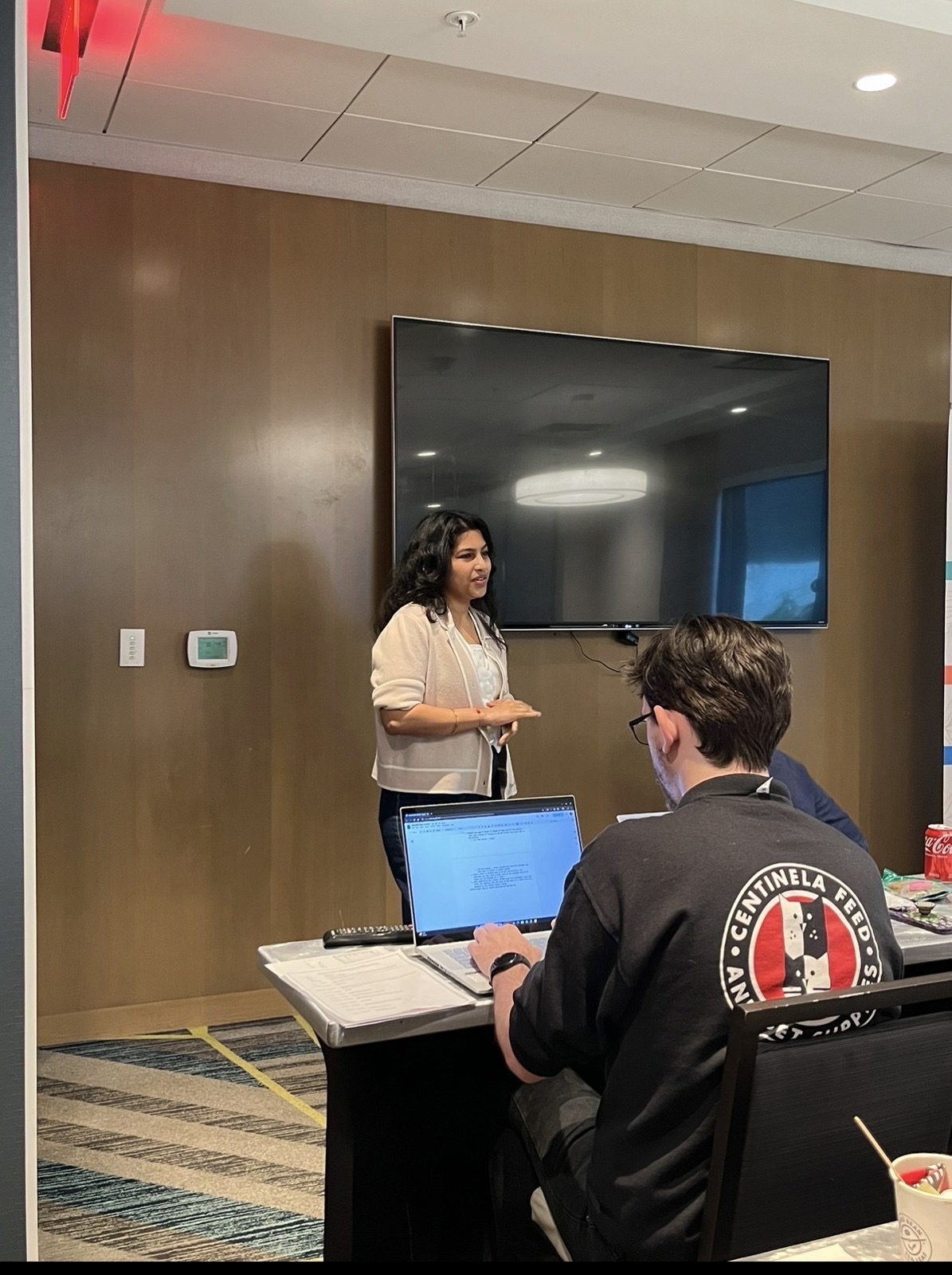
- Led the end-to-end UX audit, interviewing pet owners, store general managers and customer support teams.
- Worked with the social media team to rebrand and reposition the company's value.
- Partnered with the data team on reports and dashboards for the current site, and with design engineers and frontend developers to optimize the design system.
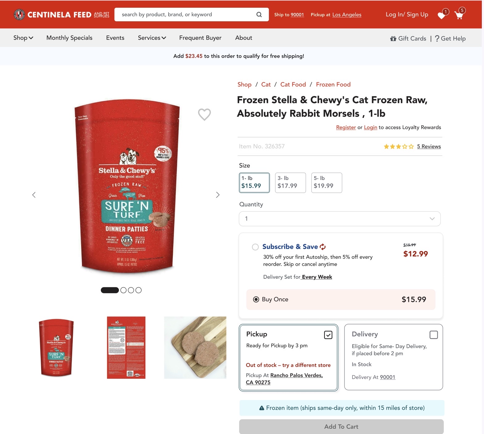
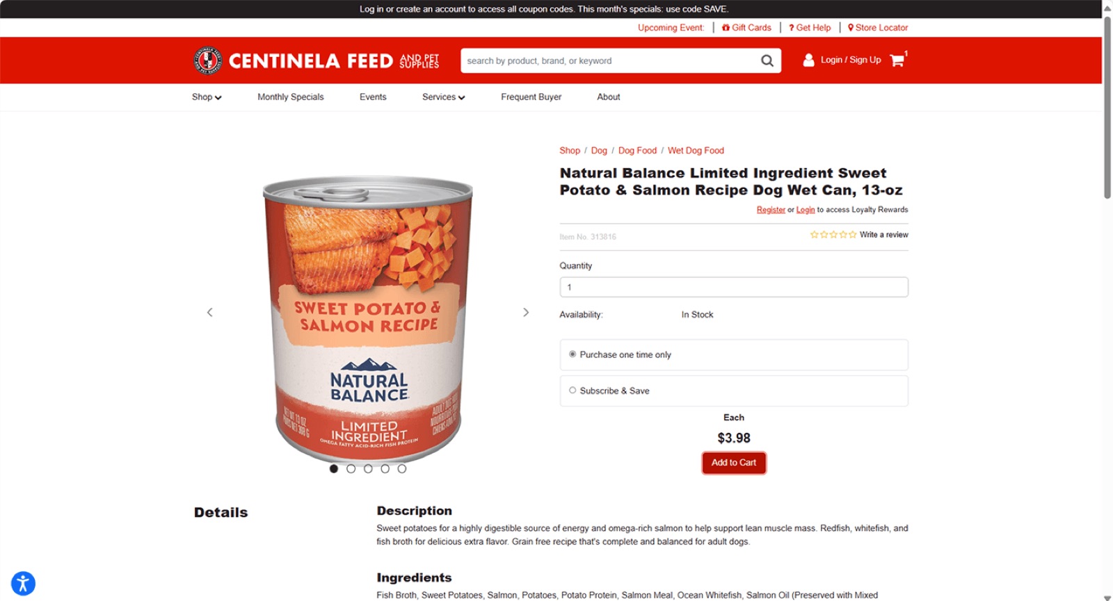
The product page showed no real-time stock.
The store's system held the full inventory list. The website showed none of it.
Customers noticed the gap first. They'd order a bag of food online, then get a cancellation, or see same-day delivery slip to two days, or receive a cancellation email a day later. So they stopped trusting the site. Some started calling the store to confirm stock before ordering. Others skipped the site and drove over to check the shelf themselves.
A stock label would have relabelled a bad number.
The first read was that this was a content problem: add a stock status label to the product page and move on.
The deeper issue sat further back. Centinela had no reliable way to surface real-time, store-level inventory at all. The product page was just the last stop for a number that was already unreliable by the time it arrived.
Customers would see a stock status with more confidence than before, on inventory nobody on the retail side could stand behind. That's worse than showing nothing. It would paper over a supply chain problem, and the next round of cancellation emails would land with even less trust behind them.
Understanding the root cause before drawing anything.
I ran a mixed-method UX audit:
- Interviews with 12 pet owners, 3 general managers, 1 retail division head and 2 customer support reps.
- Heuristic evaluation across all key pages.
- Salesforce dashboard analysis with the data team.
- Session recordings to map drop-off points.
"I can't tell if the food I want is in stock at my local store, so I just go in person."
Pet owner, interview
Stock visibility was broken. Customers defaulted to the store because the online inventory wasn't trustworthy.
Offline pain, online frustration
The audit and interviews surfaced the pain points of shopping in store and the frustration with the website.
A recurring pattern
With the data team I mapped fulfilled against cancelled orders over a set period. The inventory mismatches were real and recurring, not isolated incidents.
Two systems, two counts, and nothing for the customer.
Retail managers tracked two numbers: shelf stock, and a safety-stock buffer called the ATF. Customers online saw nothing at all, and neither number alone was safe to show them.
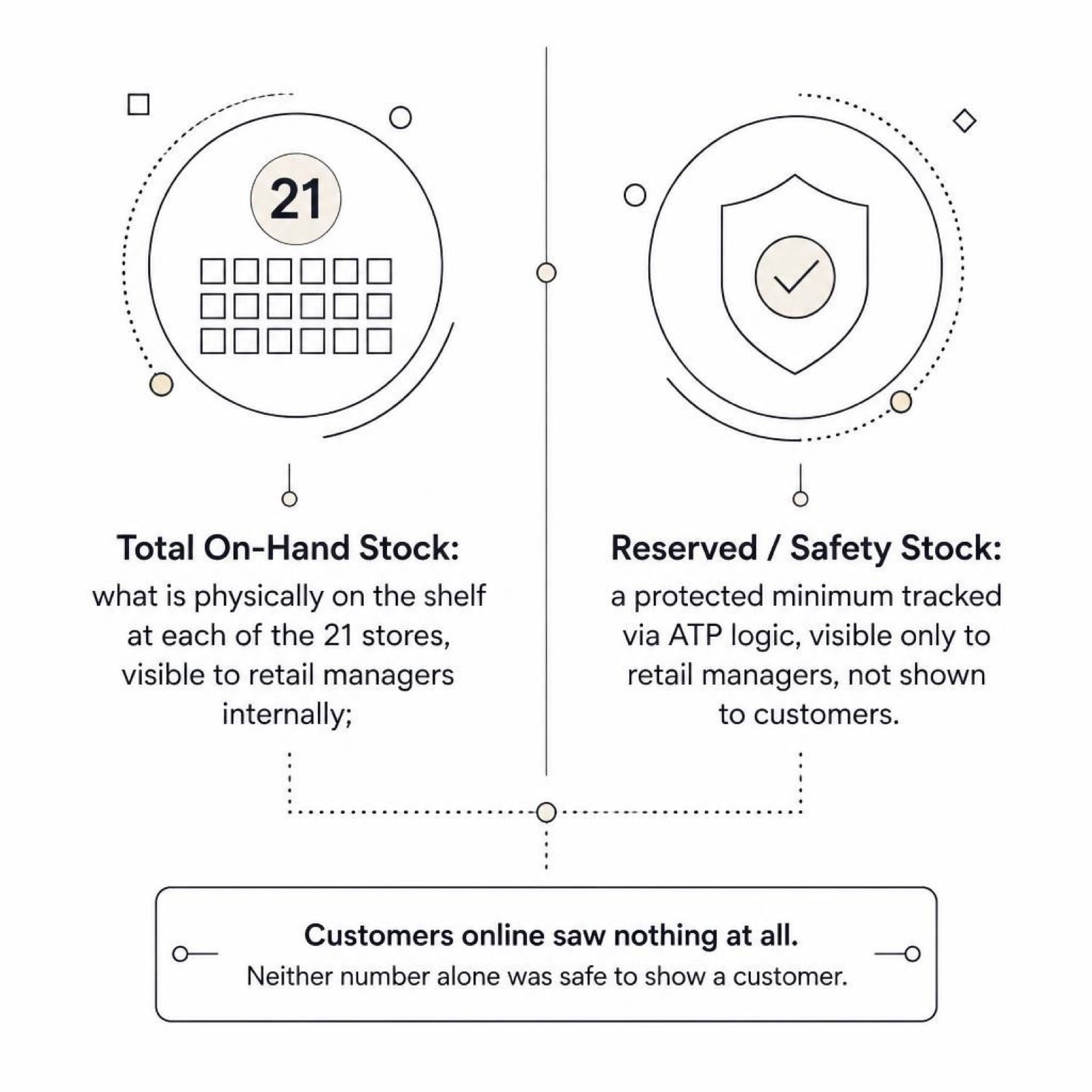
Every order ships from a store, not a warehouse: pickup, same-day or standard shipping. If the number on the page was wrong, there was no backup plan to quietly fix it.
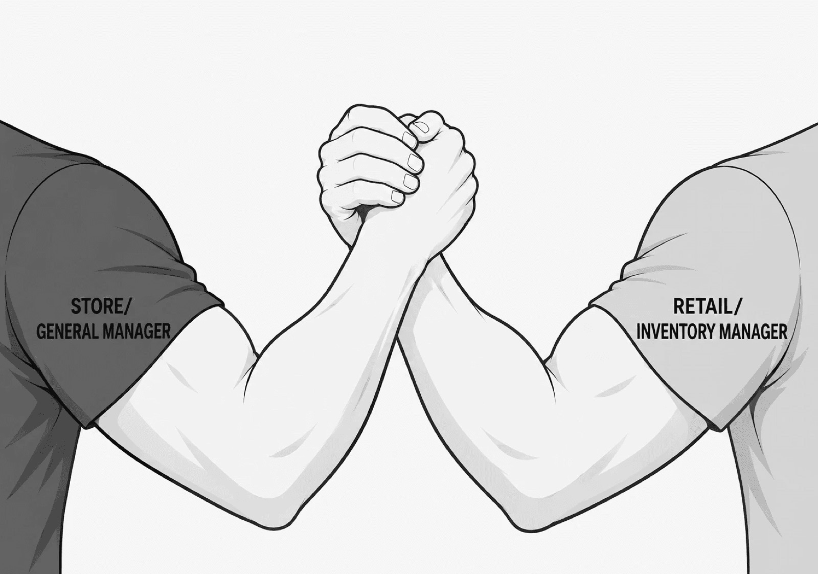
The real first step was alignment
Making the live number match reality meant getting two groups who rarely talked to each other on the same page.
Close to the customer
Non-technical and closest to shoppers in the store, but not the ones tracking stock numbers in Salesforce.
Close to the data
Technical and owners of the real inventory data, but with no view of how customers read the website.
One honest, available-to-sell number per store.
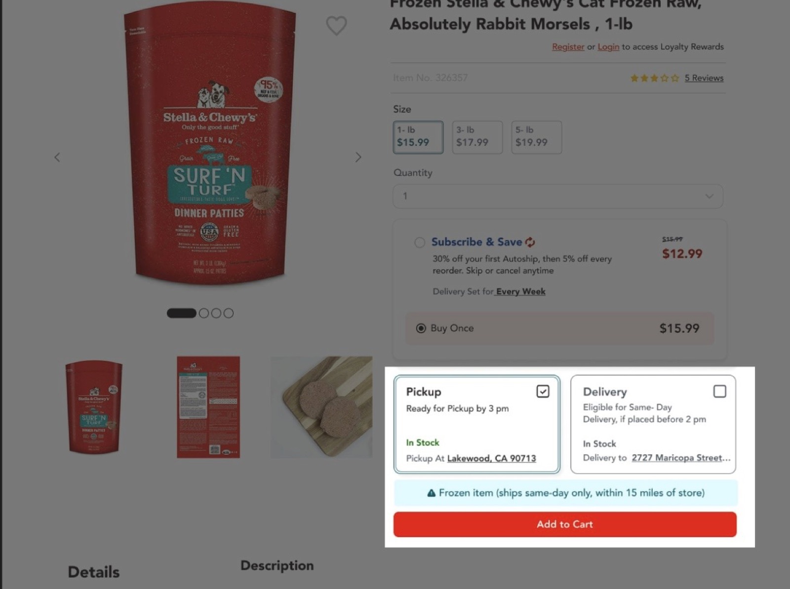
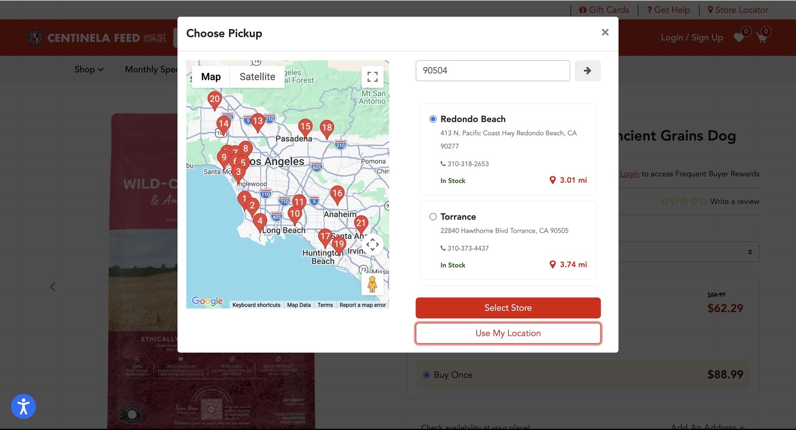
Live, store-level inventory now appears on the product page, pulled from the same supply chain data store managers use for fulfillment and tied to the store the customer selects.
That meant reconciling two numbers that had never talked. Total stock on hand and the reserved minimum now feed a single available-to-sell number, generated per store in real time. The product page stopped guessing and started reflecting the shelf.
The question gets answered on the page
"Is this in stock near me?" is answered before checkout. No "Out of Stock" three steps later, no cancellation email a day after ordering, no drive to the store to check.
The front end matches the back end
Fulfillment stopped fighting the website, and the number customers saw was one the retail team could stand behind.
The hardest part: designing around a safety buffer
Stores held back a safety buffer so in-store shoppers wouldn't be shut out by online orders. I had to understand that distinction well enough to design around it, then translate it between both teams so the online experience matched what actually happened in the backend.
To make the translation stick, I mapped what happens when a store can't fulfill an order and has to reroute it to another location, in plain terms both teams could follow.
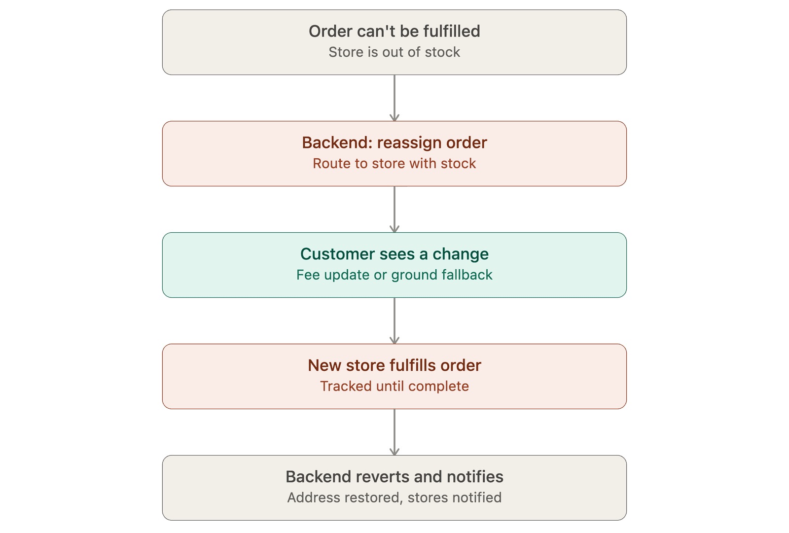
Rerouting happens after checkout, so it isn't the browsing-stage root cause. It is proof the inventory issue ran deeper than the product page, which is why the fix had to correct the data, not just the display.
Before and after.
The process that got it shipped.
UX audit and problem validation
The multi-method research above, done before any screen was touched.
Wireframes and PRD
A spec covering inventory logic, interaction states and technical dependencies for engineering.
High-fidelity design
Built with the existing design system rather than around it.
Handoff and implementation review
Weekly build reviews with design engineers and frontend developers, alongside the stakeholder alignment.
Flow implementation.
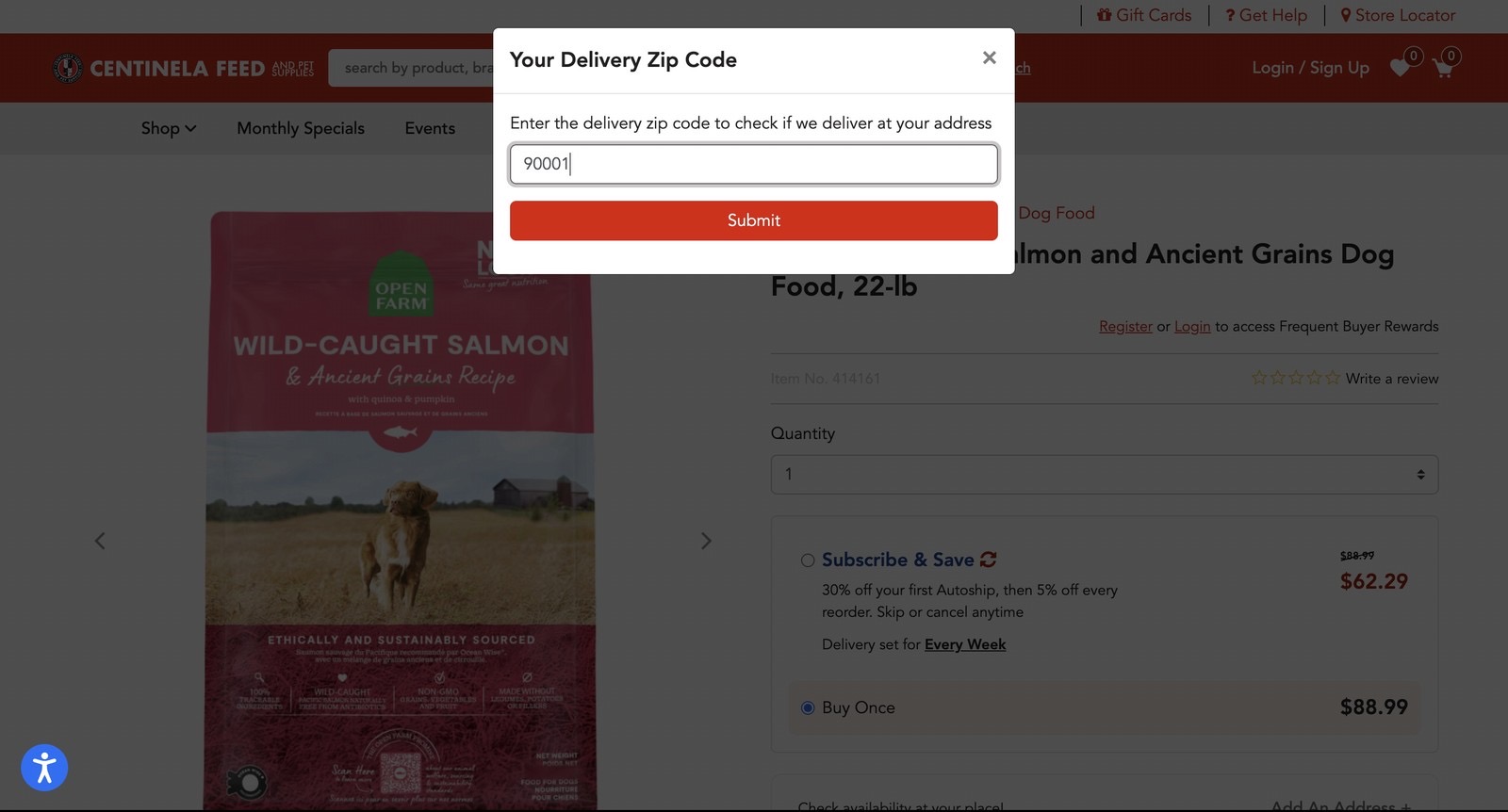
A walkthrough of the live product page: the shopper picks a store, and Pickup and Delivery show real availability before anything goes into the cart.
What the redesign moved.
I don't have a clean post-launch number isolated to this feature. The figures above belong to the wider redesign this work was part of.
The larger project scope
- Mobile-first rework of the product and checkout flows.
- A reworked subscription flow.
- Design system scaling: typography, tokens and components across the redesigned pages.
- Competitor analysis and ongoing funnel analysis feeding prioritization.
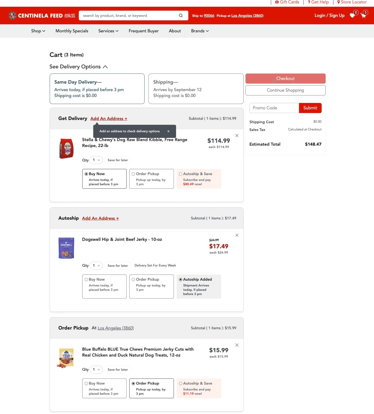
Screens from other Centinela projects.
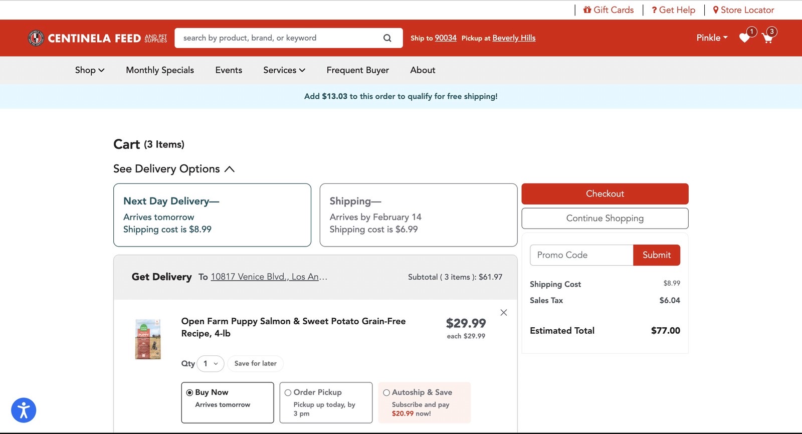
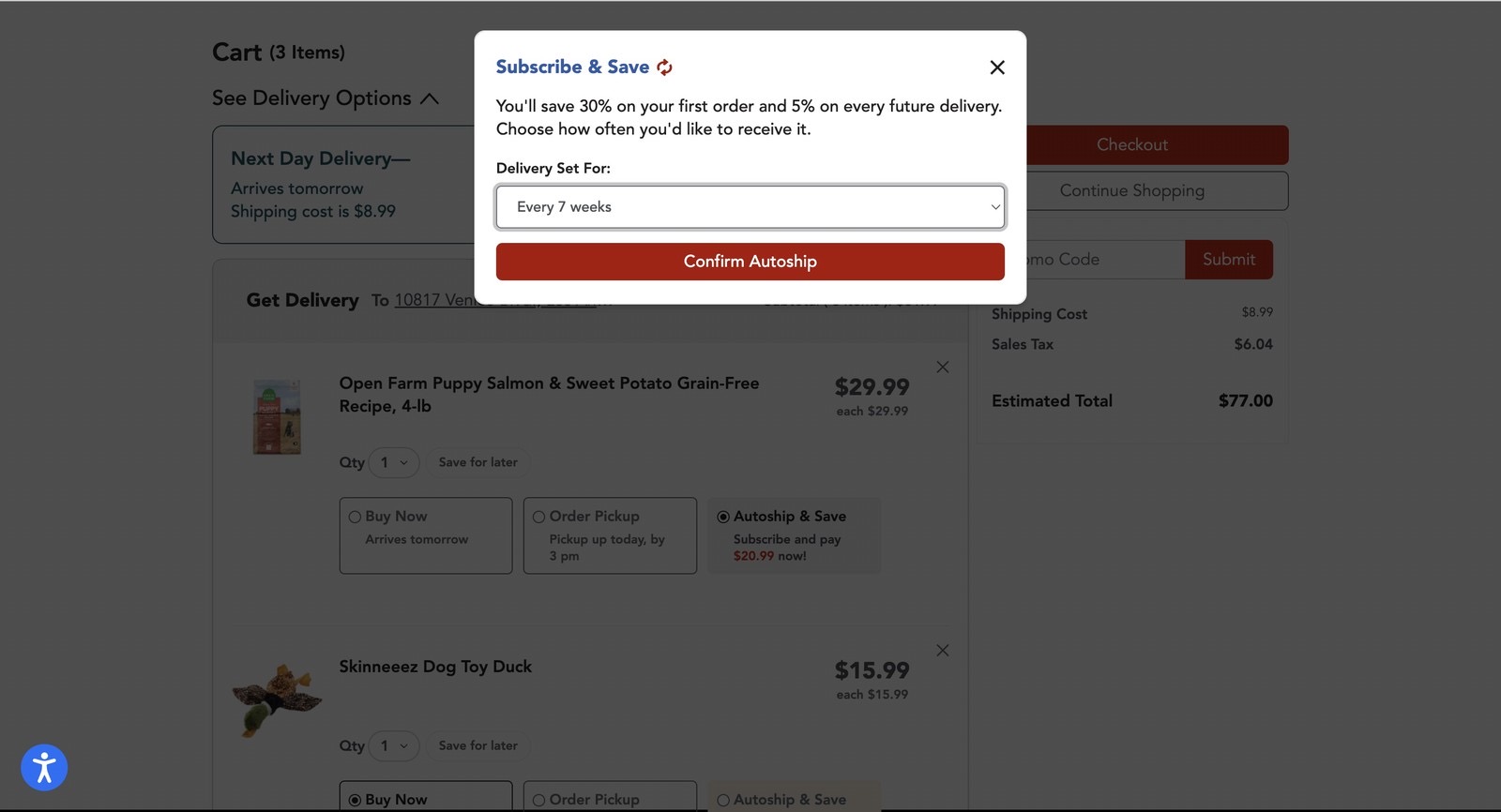
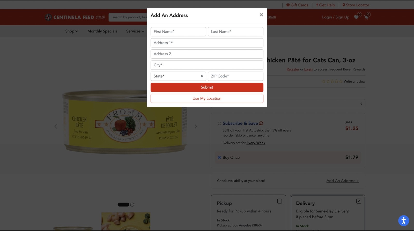
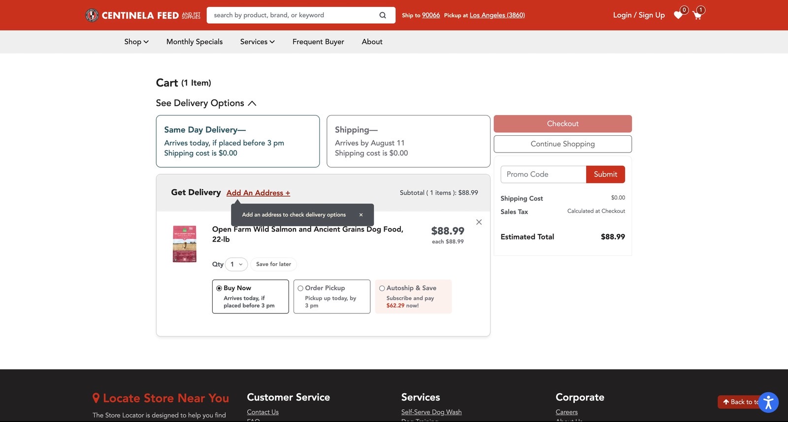
What I'd do differently.
I'd validate the support team's pattern data before the general manager interviews, not after. It would have focused my first round of interviews faster.
Cart page redesign
Reducing decision fatigue by cutting 5 choices to 1. This Centinela case study is locked under NDA. Ask me about it in person.